


Cover to Cover

The cover of a book matters. Publishers know this, and they put a lot of thought into designing them. It’s interesting to think about what draws you to a cover—something you’re often reacting to only subconsciously. So, I thought it would be fun to pull some books off my own shelf with covers I find interesting—both hardcovers and paperbacks—and consider what makes them work for me.
One thing I learned is that the imagery—what’s portrayed—is less important to me than the colors and the design and even the texture of the jacket—how it’s portrayed. I want a cover that looks beautiful and feels a little bit fancy. This makes perfect sense. Publishers hope that the way a cover looks or feels will make you pick up a book, and then you’ll read the jacket—because, why not?—and the text will close the sale.
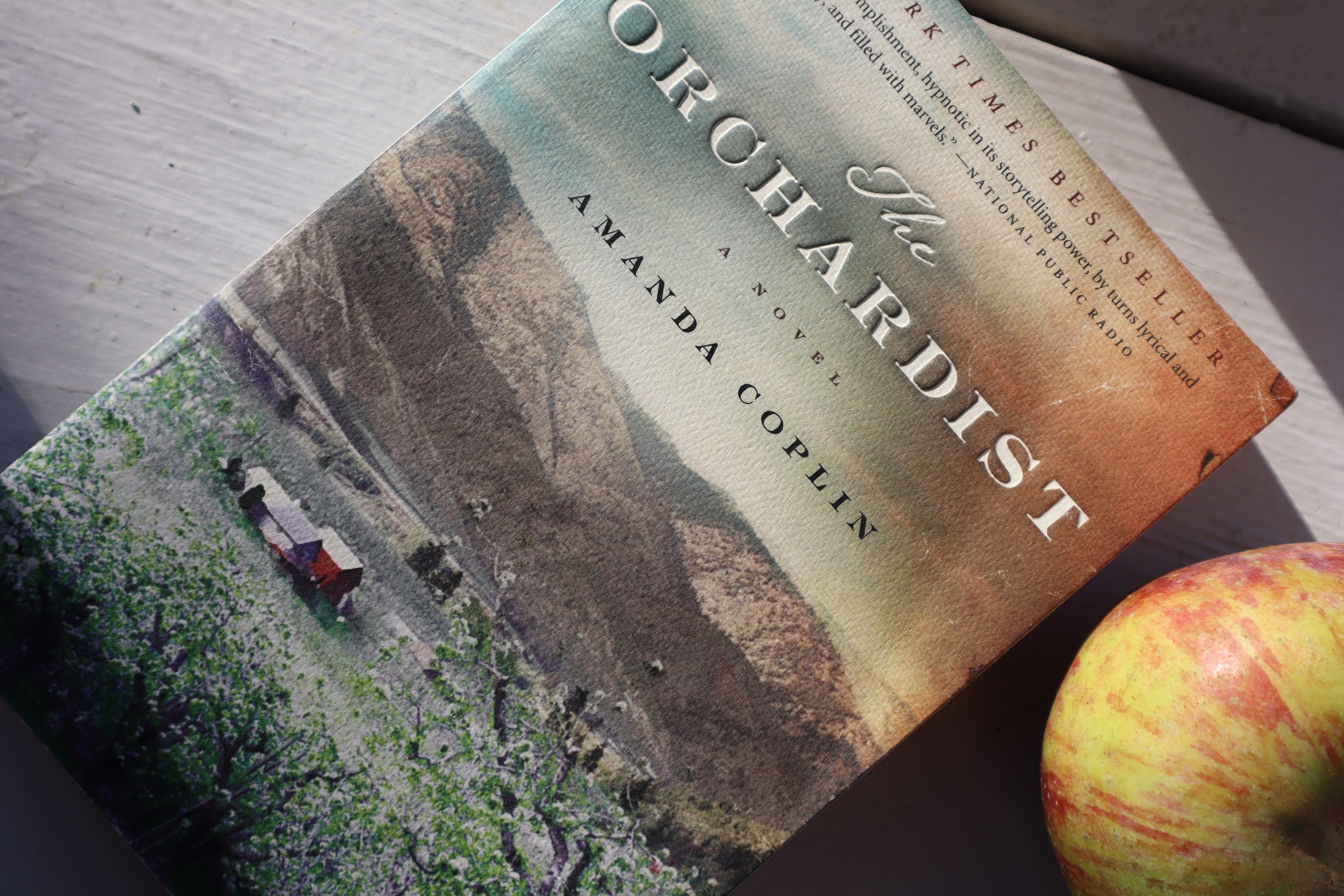
One book that I’m sure I initially picked up just to admire its cover is Amanda Coplin’s The Orchardist. Designed by Richard Ljoenes, this cover with its verdant landscape and lush range of color, from the blossoming trees in the foreground to the rusty corner of the sky, reeled me in. The deal was probably sealed by the words “New York Times Bestseller” and an NPR blurb at the top and more reviews from reputable publications on the back cover.
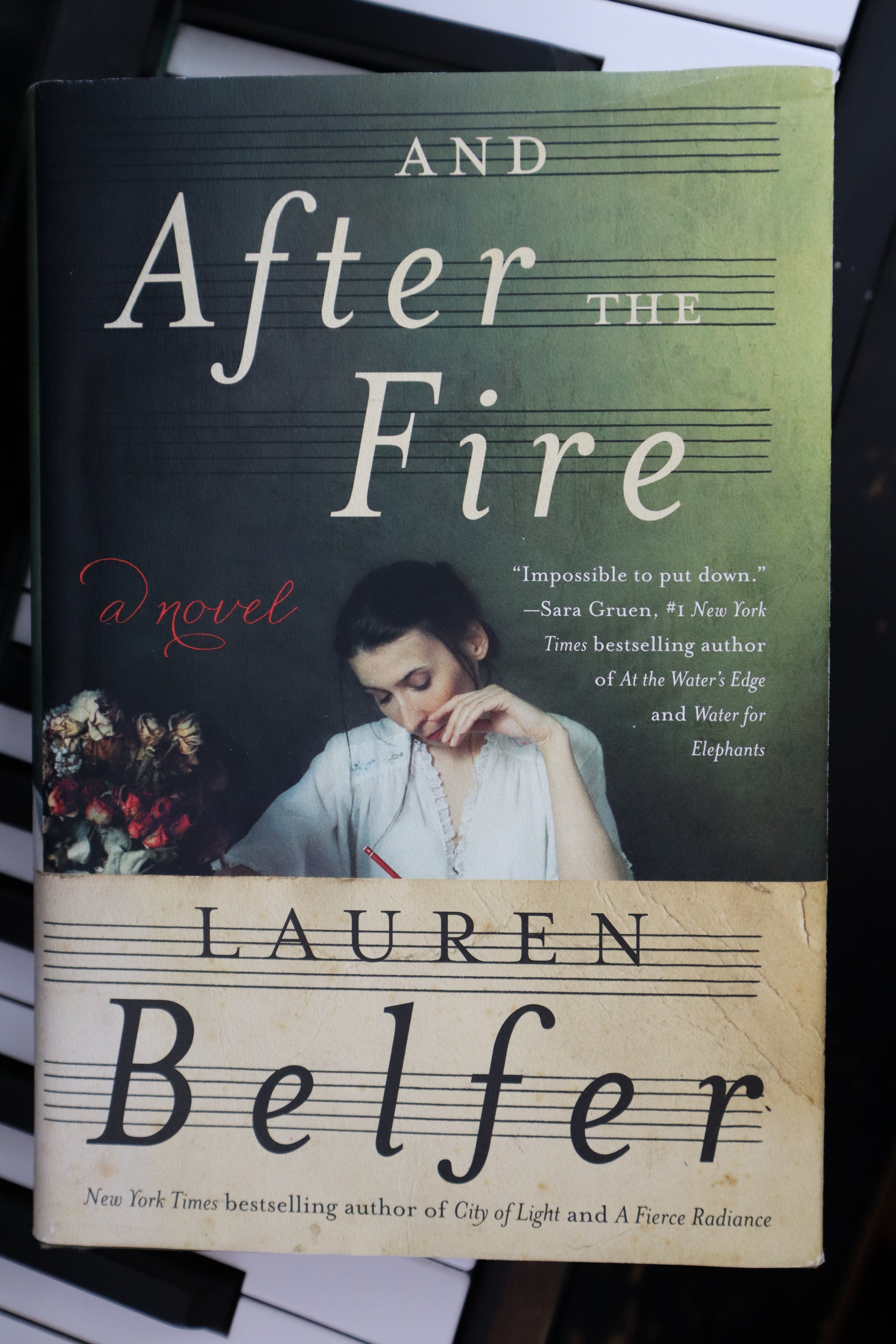
Lauren Belfer’s And After the Fire, designed by Milan Bozic, is similarly lovely. Its cover offers the trope of a beautiful woman who looks like she’s stepped out of a costume drama—with a twist. This woman is working on something, and she doesn’t seem to care whether we notice her or not. Her work is hidden behind the author’s name, providing a bit of mystery. You know it has something to do with music because those bands of five lines across the bottom are musical staffs; not a single musical note interferes with the lettering, though the lower case Fs in “After” and “Belfer” look a lot like the f-holes on a violin. This cover, to me, is pretty and compelling, with that splash of color to the side. Helpfully, it also signals its genre—in this case, a historical romance with serious artistry.
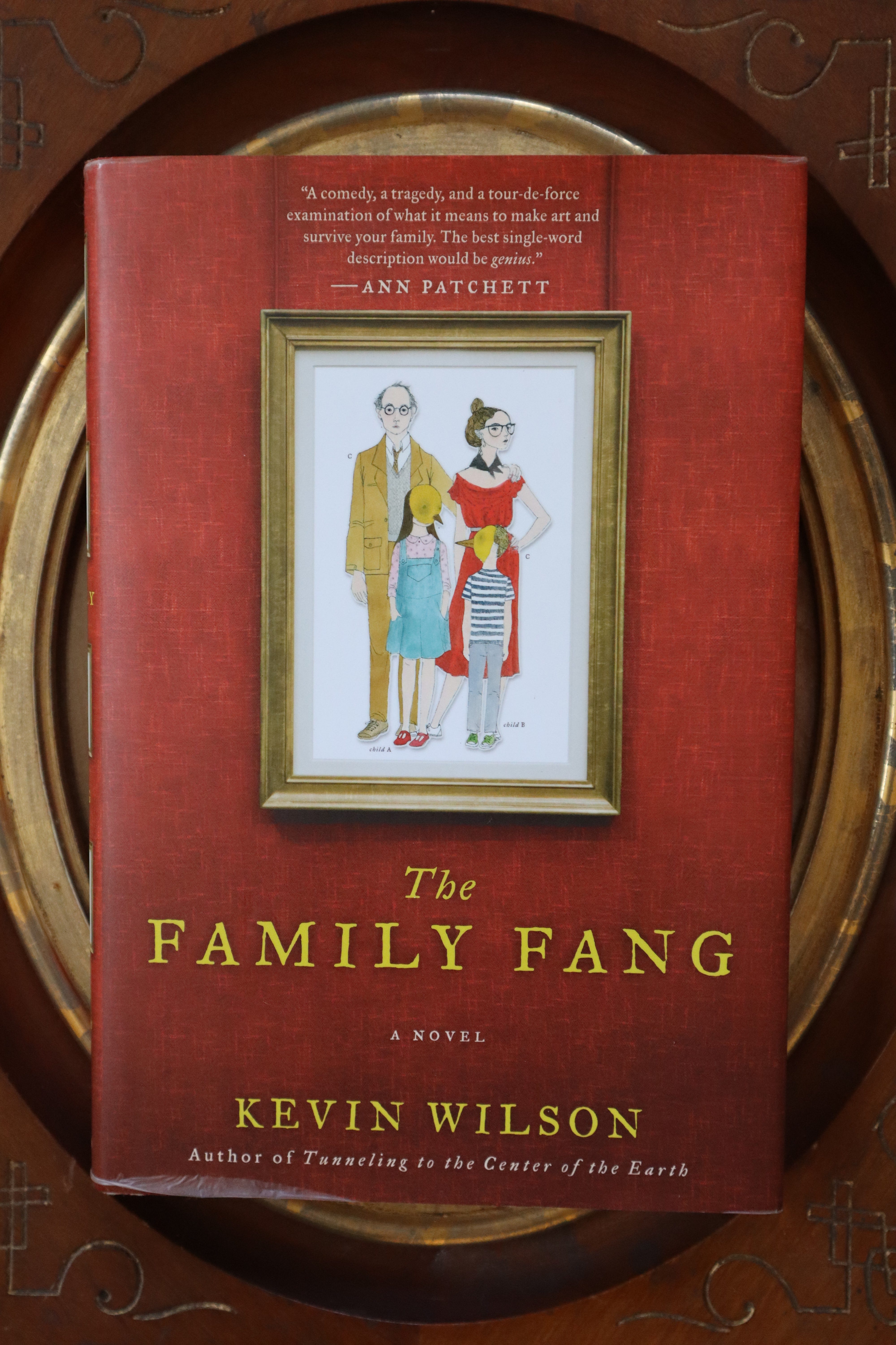
Like Belfer’s, the best covers are sympathetic with the content of the pages they hug. They also communicate a shorthand: This is a romance. This is a beach read. This is serious literature. And so on. Signaling genre is actually pretty important. Publishers who trick readers into mistaking a genre will often pay for it with bad reviews because readers didn’t get what they expected. The challenge is to send the correct signal in a fresh, new way so the cover doesn’t look like a stylistic knockoff. For example, the cover of Kevin Wilson’s The Family Fang, designed by Allison Saltzman, signals that it's offbeat, funny, and smart. We’ve seen book covers before with a framed family portrait on the cover, but this one upends that theme with the portrait of an utterly quirky family.
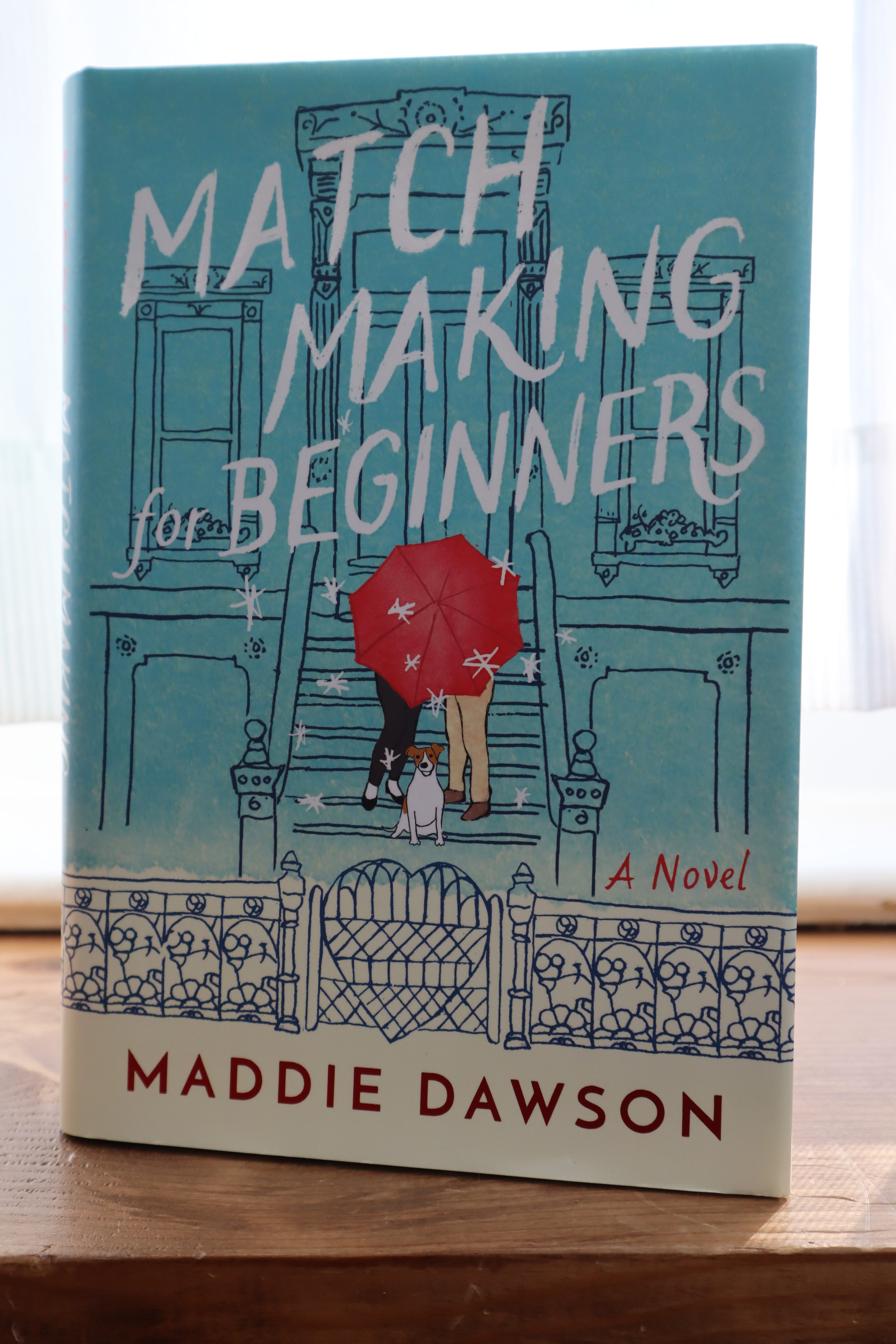
For Maddie Dawson’s Match Making for Beginners, designer David Drummond conveyed that book’s magical, imaginative qualities with a line drawing on a pretty robin’s egg blue wash with a red umbrella popping in the middle, all studded with white stars. Though this is likely unintentional, for me, this design hearkens back to the first edition of From the Mixed-Up Files of Mrs. Basil E. Frankweiler, with its line drawing of stairs leading to a building and two primary figures whose faces we can’t see. Regardless, Match Making for Beginners doesn’t look like any other book cover in the past 50 years. It telegraphs fun reading and—I don’t think it’s a spoiler to suggest it—a happy ending.
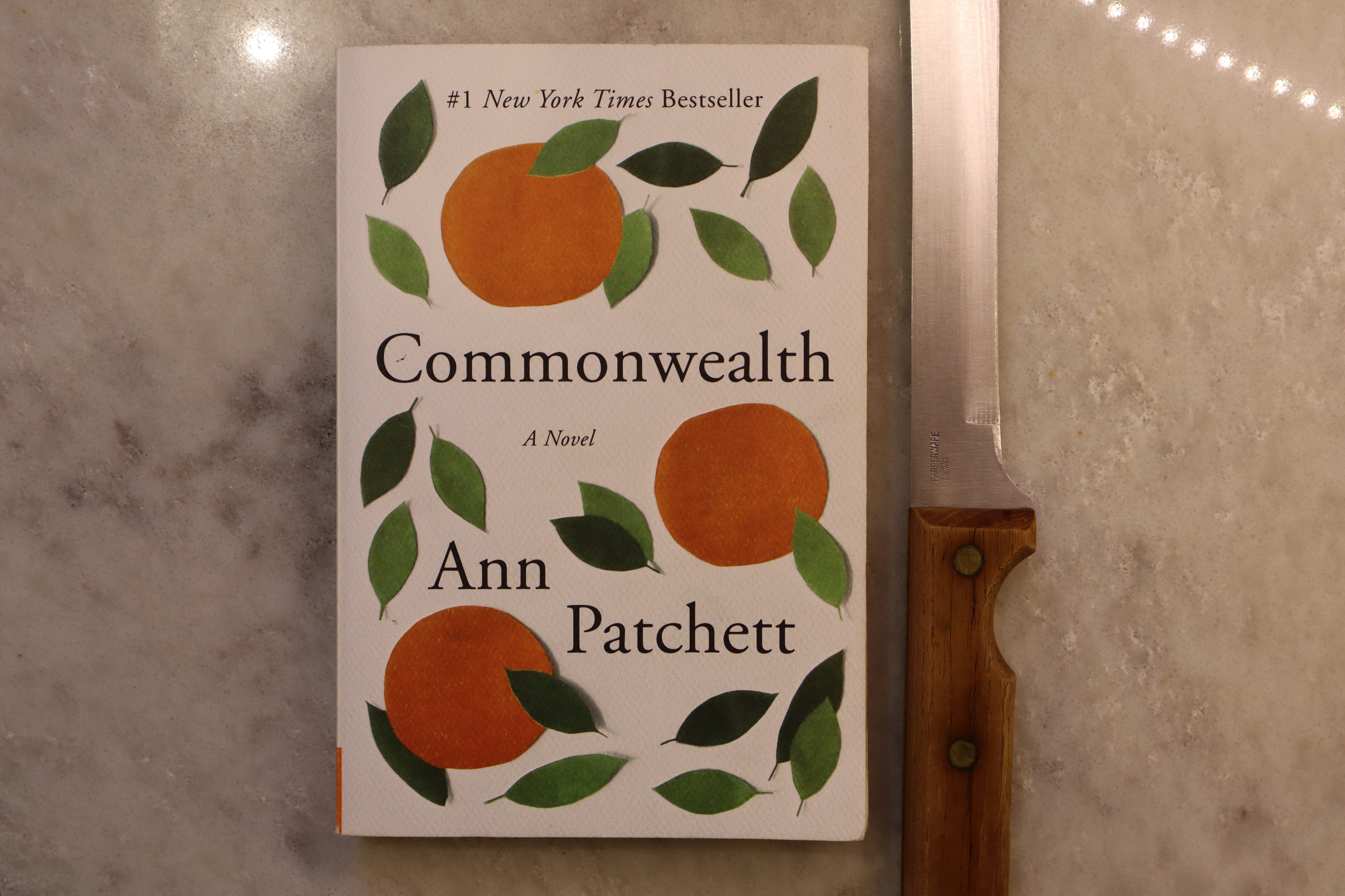
Some of the covers I like best are very simple—versions of yet another cover trope of displaying one item, like the oranges-and-leaves cover of Ann Patchett’s novel Commonwealth, designed by Robin Bilardello. The colors are cheerful, the shapes look like paper cutouts reminiscent of a Matisse print, there’s plenty of breathing room between them, and the whole cover has a woven texture you can actually see, like a tablecloth. Its matte finish feels good, too.
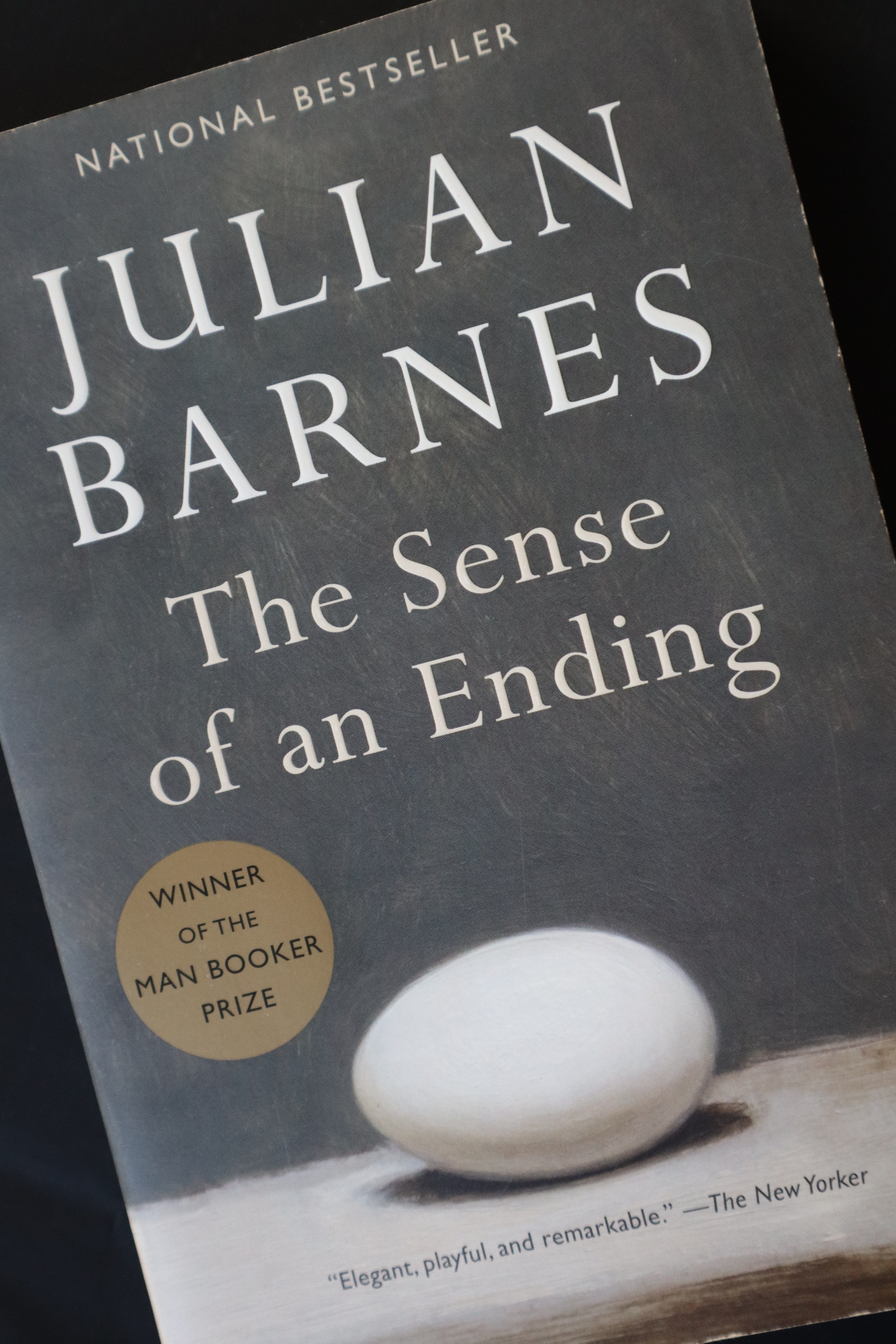
The minimalist cover of Julian Barnes’s The Sense of an Ending, designed by Megan Wilson, beckons to me in similar fashion. These shades of white and gray are soothing rather than cheerful, but the simplicity of the egg—which, upon closer examination, has the kind of textured surface that comes from a paint brush—seems to telegraph something more, just like Patchett’s oranges. Both of these books also have deckle-edged pages, meant to simulate old-fashioned hand-cut paper, and cover flaps you might use to tuck around the pages you’ve read like a bookmark. Even though these books are paperbacks, they were given a budget for more upscale printing.
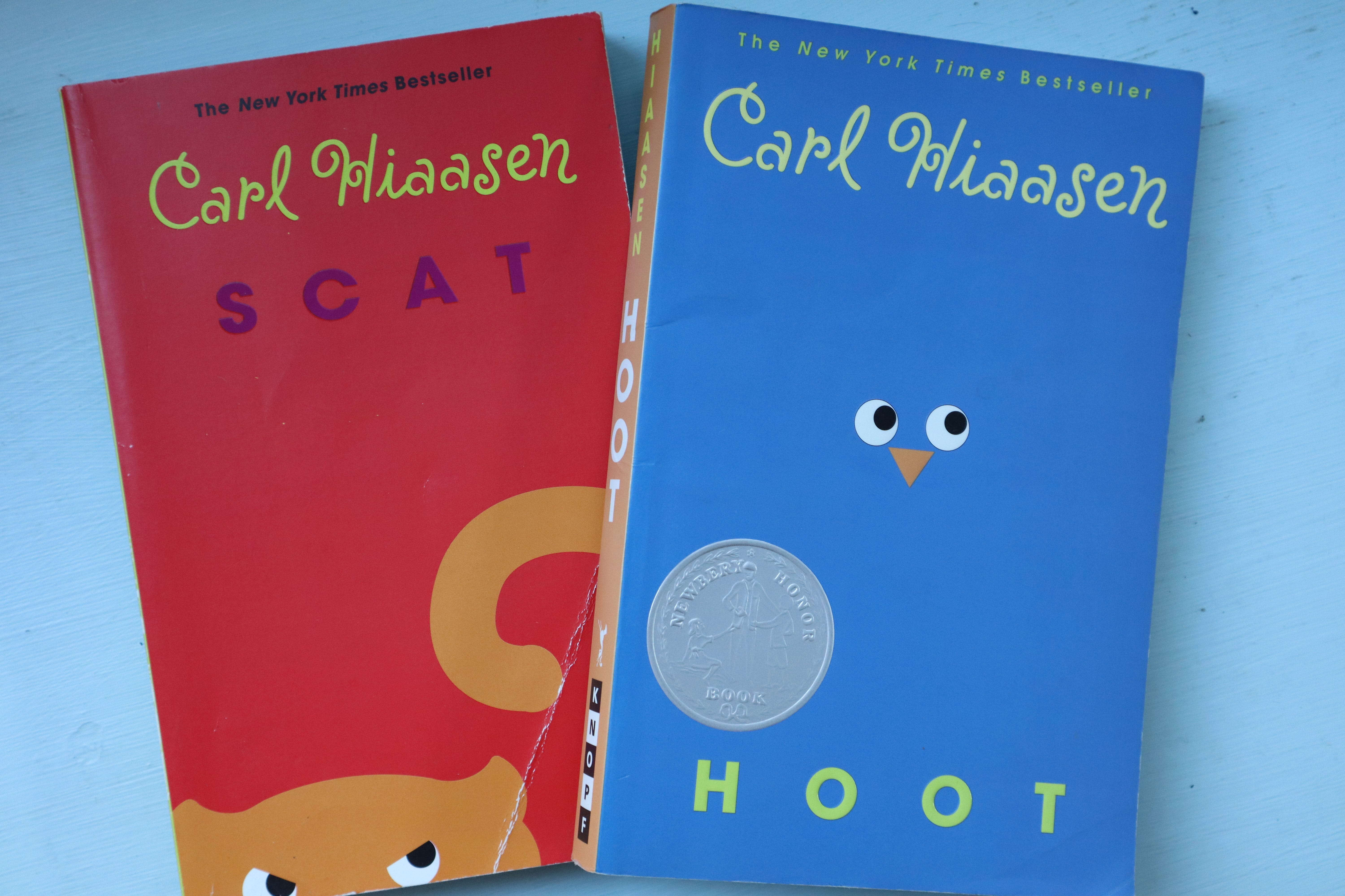
Carl Hiaasen’s uncredited covers are minimalistic, too, in concert with one-word titles like Hoot and Scat. They’re brightly colored and fun, matching Hiaasen’s style. I like it when a consistent style is maintained among an author’s books—assuming the books themselves are consistent. Maddie Dawson’s recent covers do this, too. Series of similar covers look great on the shelf, and each one invites you to consider the next.
Sometimes cover designs catch on, and you’ll see them duplicated like siblings. I really like the cover of David Mitchell’s The Thousand Autumns of Jacob DeZoet, designed by Lynn Buckley. It’s layered and colorful with tiny, intriguing details and the suggestion of a Japanese-style print.
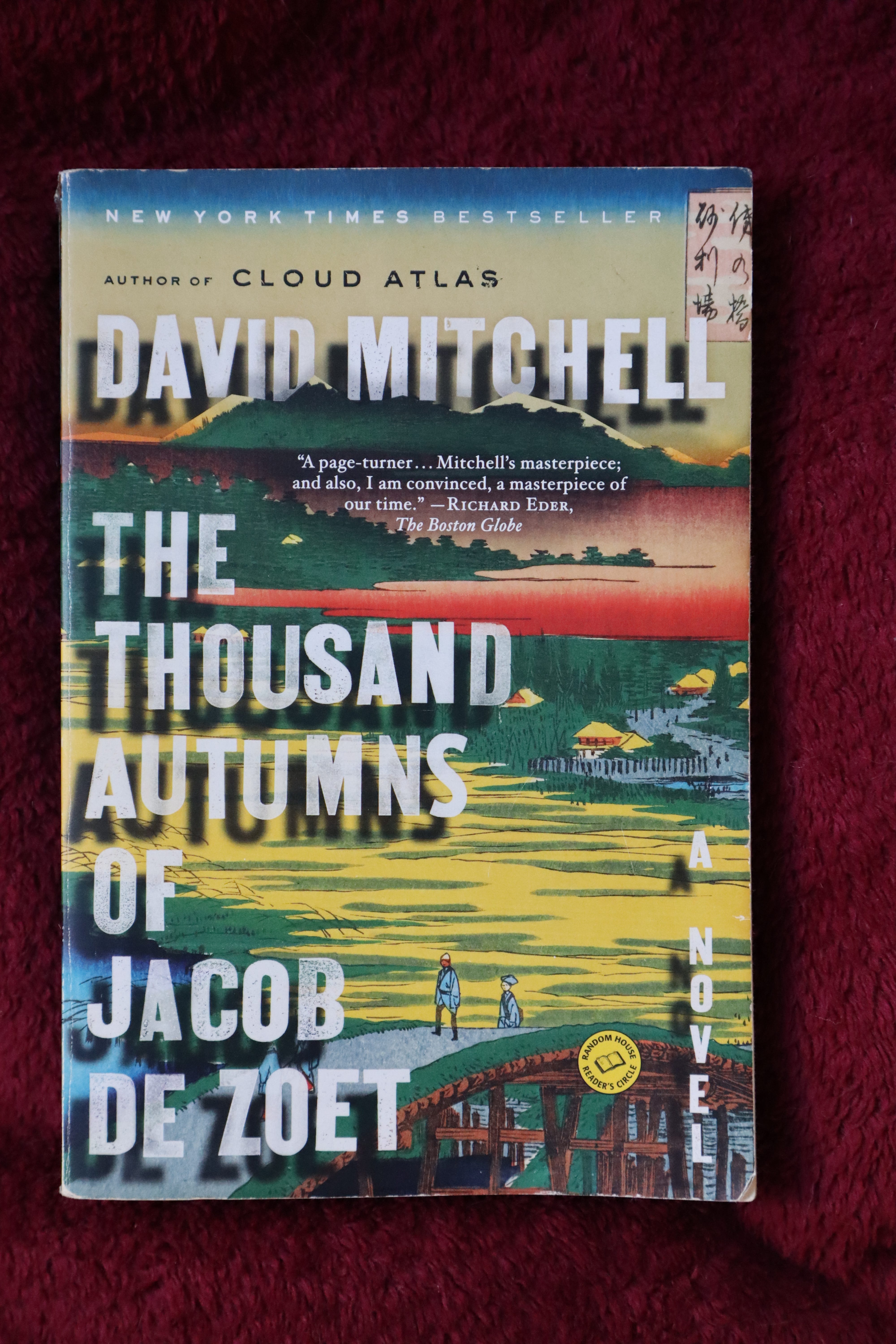
It apparently did well because similar covers began to surface. Take a look at Ruth Ozeki’s A Tale for the Time Being (uncredited) and Yann Martel’s The High Mountains of Portugal (by CS Richardson with Barb Dunn).
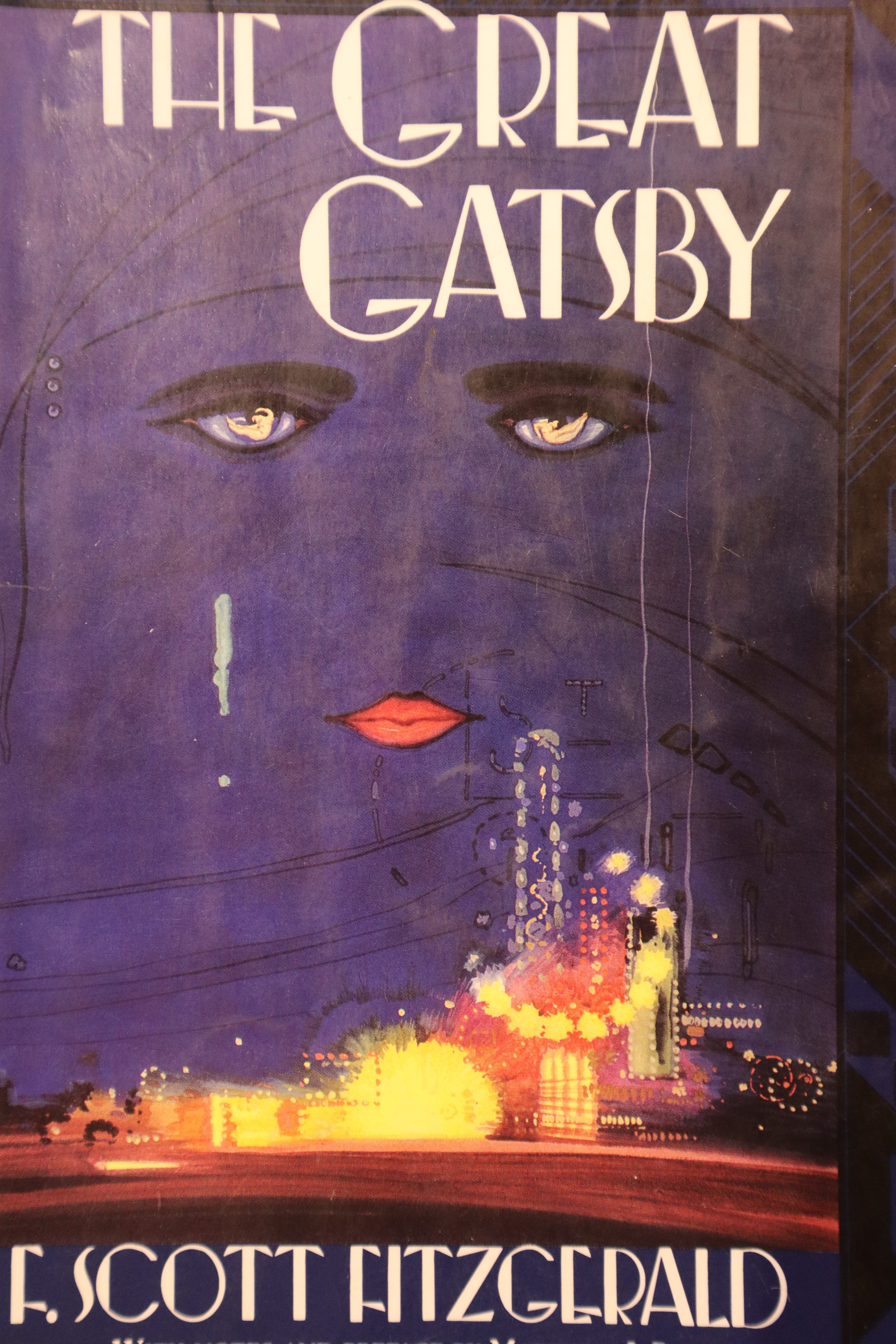
Covers often borrow and play upon what’s hot until the theme becomes classic. Think of that ubiquitous pair-of-hands-holding-a-small-item theme. (Someone in the industry once told me that the head buyer at Barnes & Noble asked publishers to stop doing those covers, she was so sick of them.) Other covers are classics in and of themselves. If you haven’t seen the original indigo cover of The Great Gatsby with its disembodied eyes, from a painting by Francis Cugat, look closely. The more you look at it, the more you see, and all of it alludes to something in the story. It’s one of the most intriguing covers, I think, in literary history, and there’s a whole story behind it, which you can read here.
What are some of your favorite book covers, and what do you love about them?